Latest news
LOL Rebrand - (9/1/2025)
While our mission and vision have remained the same, our logo and branding needed some modern updates. Our new design partner helped us to create a new logo set and establish typefaces that not only fit our identity but also reflected our mission here at Living Out Loud. Our new logo still includes our iconic sun and "progress to success" motto with slight updates to our primary colors.


Our Logo
Our Typefaces
Our multi-layered logo defines our identity here at Living Out Loud and speaks volumes to the impact our work entails. The sun represents positivity, energy, growth, and unapologetic self-expression. Its core symbolism is consistently used in our brand to communicate a positive and bold message; our sun icon also holds meaning specific to Living Out Loud, such as new beginnings, growth, and enlightenment.

Primary Logo
Enthalpy 298
The font Enthalpy 298 is used as the primary font for our logo as well as headers throughout our website and social media. This funky display type represents the type of people we serve; they may be seen as different by others but are seen just as themselves by us.
Blackout Oldskull
The font Blackout Oldskull is our complementary font used in smaller headers, sub-headings, as well as our poster text. This script type embodies the liveliness and upbeat nature of our community.
Raleway
The font Raleway is used in a majority of our body copy and longer lines of text. As a display sans-serif typeface, its elegance and versatility match our company goals and mission perfectly. (Regular/Bold)

Alternate Logo
Arbotek
The font Arbotek is seen in our logos with the organization tagline/motto of "progress to success." This secondary body type brings more of a modern feel to our company as we all continue to grow collectively. (Light/Light Rounded/Thin/Ultra)
Our Colors
Our primary colors of red and yellow represent the unity between us and our supported individuals. The bright and vibrant hue of LOL's colors match the energy and dedication we have to serving our community.
-
Primary: #E92827 (Red), #F4D629 (Yellow)
-
Secondary: #FF6161 (Red), #FFEF98 (Yellow)
-
Neutrals: #000000 (Black)
Our Motto
Our motto of "Progress to Success" is a straight-forward, yet powerful sentiment that encapsulates our goal to advocate for individuals with developmental and intellectual disabilities. Working together, we can help them progress from where they are to where they need to be in order to be successful in life.

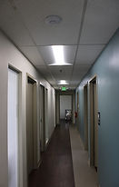
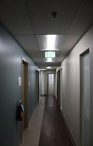
A Well- Deserved Makeover (8/15/2025)
As we continue to acclimate to our new office space in White Marsh, the bare walls needed something...fresh. In collaboration with a local graphic designer, new posters were placed throughout the office, highlighting some of our community members as a way to recognize their commitment to us and our commitment to them. Our goal was to make our brand presence known to visitors, so that they can become more educated on what we do here at Living Out Loud. There's definitely more to come as we grow, but we are now able to show those who walk through our halls that we remain true to our goals and mission.